Strategy
- Industry Research

Abry Partners’ old website didn’t reflect their position as a leading private equity investor. The design felt dated, and visitors struggled to find information about funds, portfolio companies, and team members. The site also lacked mobile optimization and an easy way for the internal team to update content, limiting both usability and credibility.
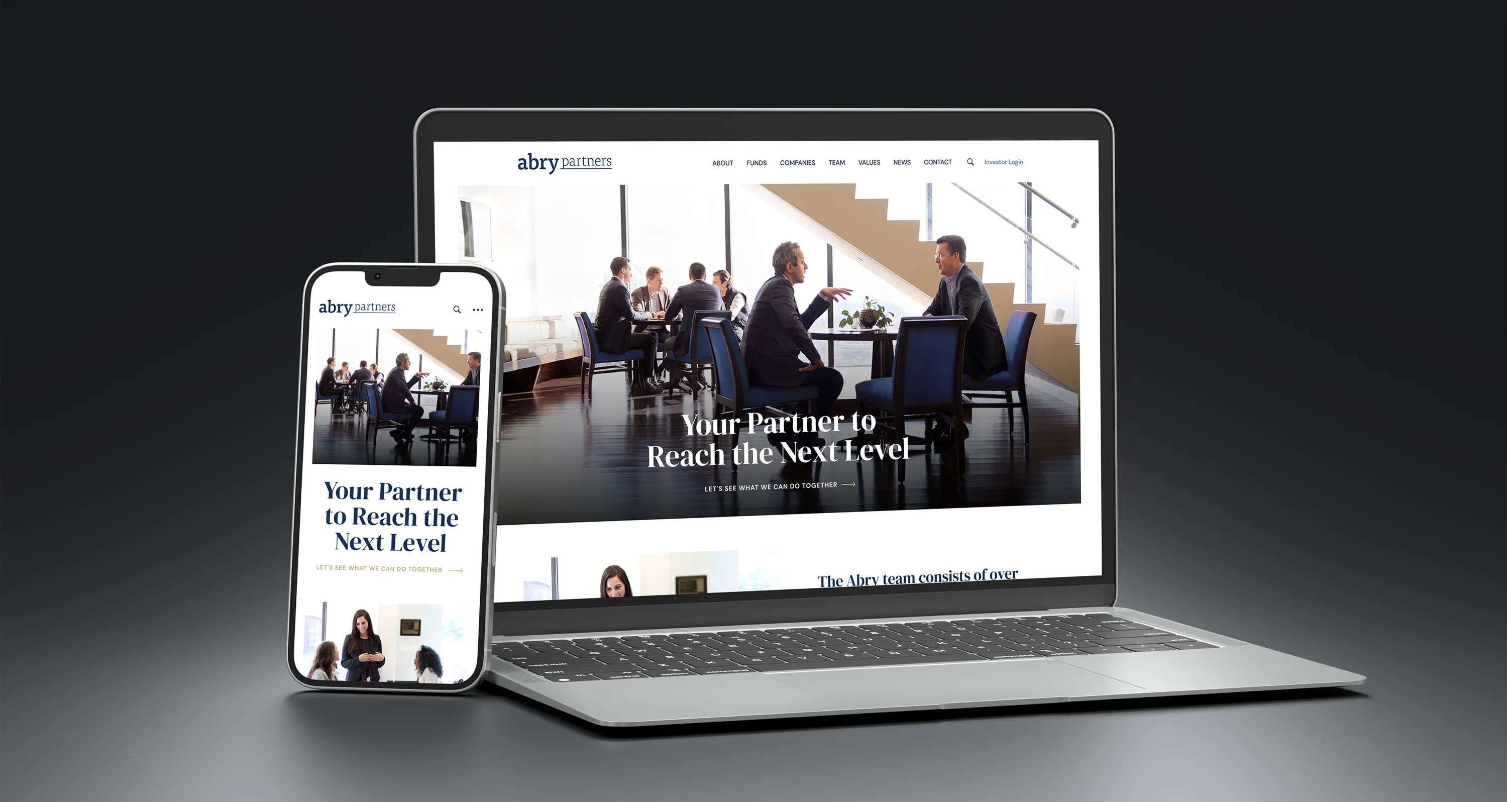
As an Interactive Art Director at Jackrabbit Design, I restructured the site around a clean, modern layout with clear navigation and consistent branding. I created designs that highlighted Abry’s focus areas and investment success. I also custom-developed a responsive website in WordPress with an optimized performance to deliver a fast, accessible user experience across all devices.
The new abry.com feels polished and professional, reinforcing trust with investors and portfolio companies. Visitors can now quickly find key information, while the Abry team can easily update news, portfolio listings, and bios without developer help. The redesign improved usability, modernized the brand, and better positioned Abry Partners as an industry leader in private equity.

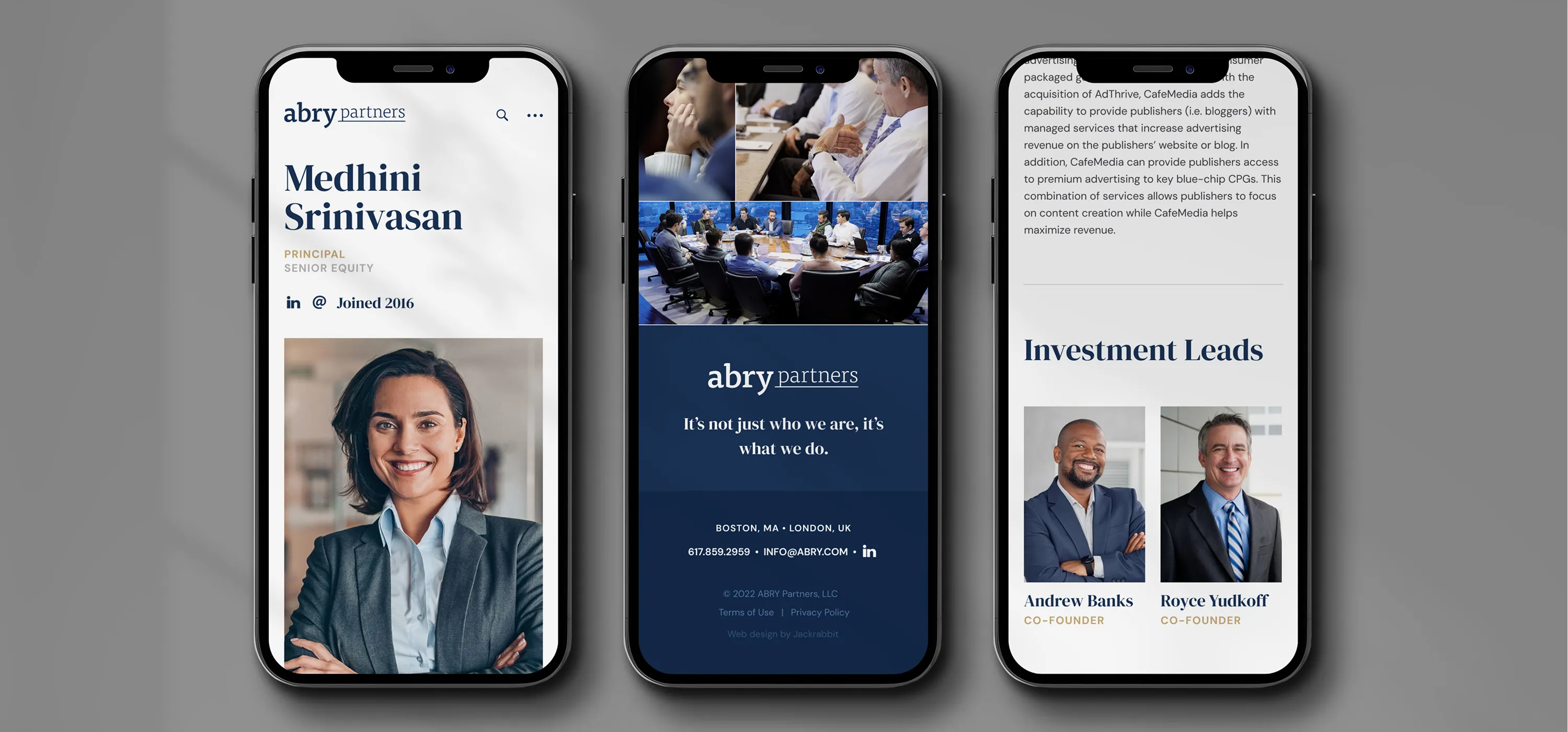
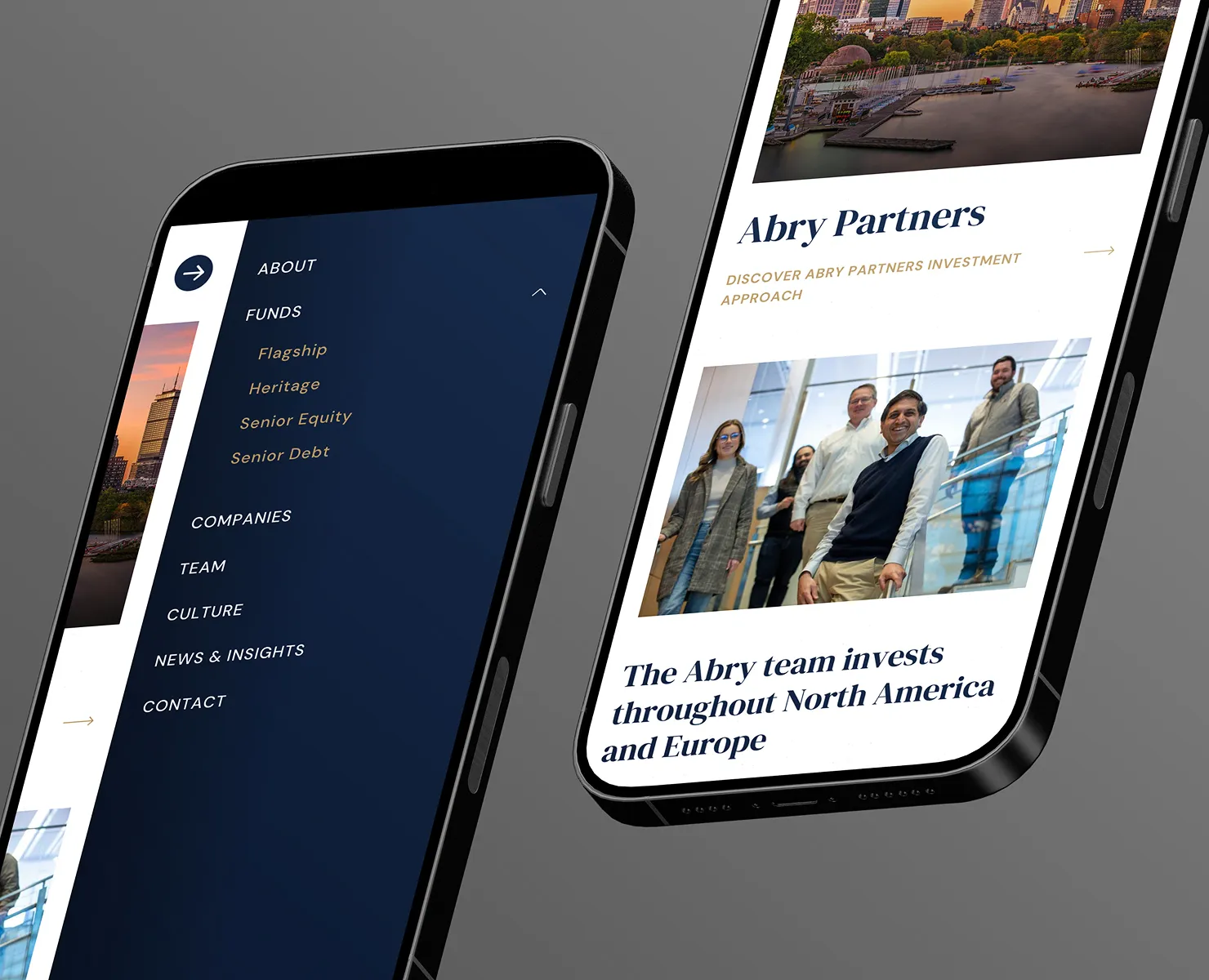
I shaped the overall structure of the site to make key information easier to understand, redesigned the visual hierarchy to highlight Abry’s expertise and team, and created modular sections that allow the client to customize the content while keeping the design consistent across pages. I focused on improving mobile readability, simplifying navigation, and using strong imagery and typography to give the firm a more modern, trustworthy presence. The entire UI system was built to feel clean, flexible, and aligned with the expectations of a high-end investment brand.
My main goal was to make the site feel modern, credible, and easy to navigate. Private equity sites are dense by nature, so I focused on reducing visual noise, grouping content into simple modules, and using strong imagery and typography to carry the brand. The structure is intentionally straightforward. Users shouldn’t have to hunt for what the firm does or who’s behind it.

