Creative
- Art Direction
- Design for Jackrabbit Design
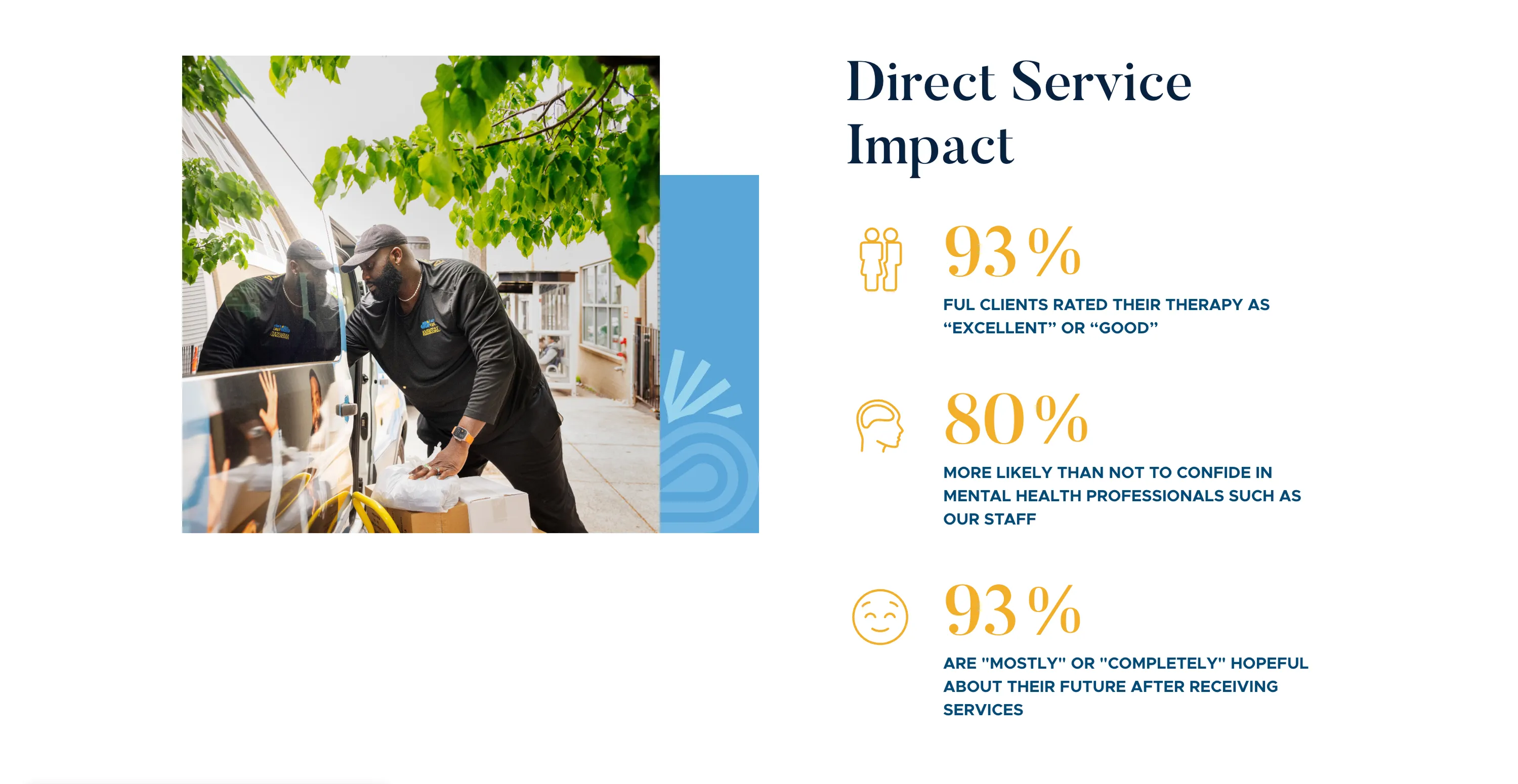
- Iconography
- Web Design

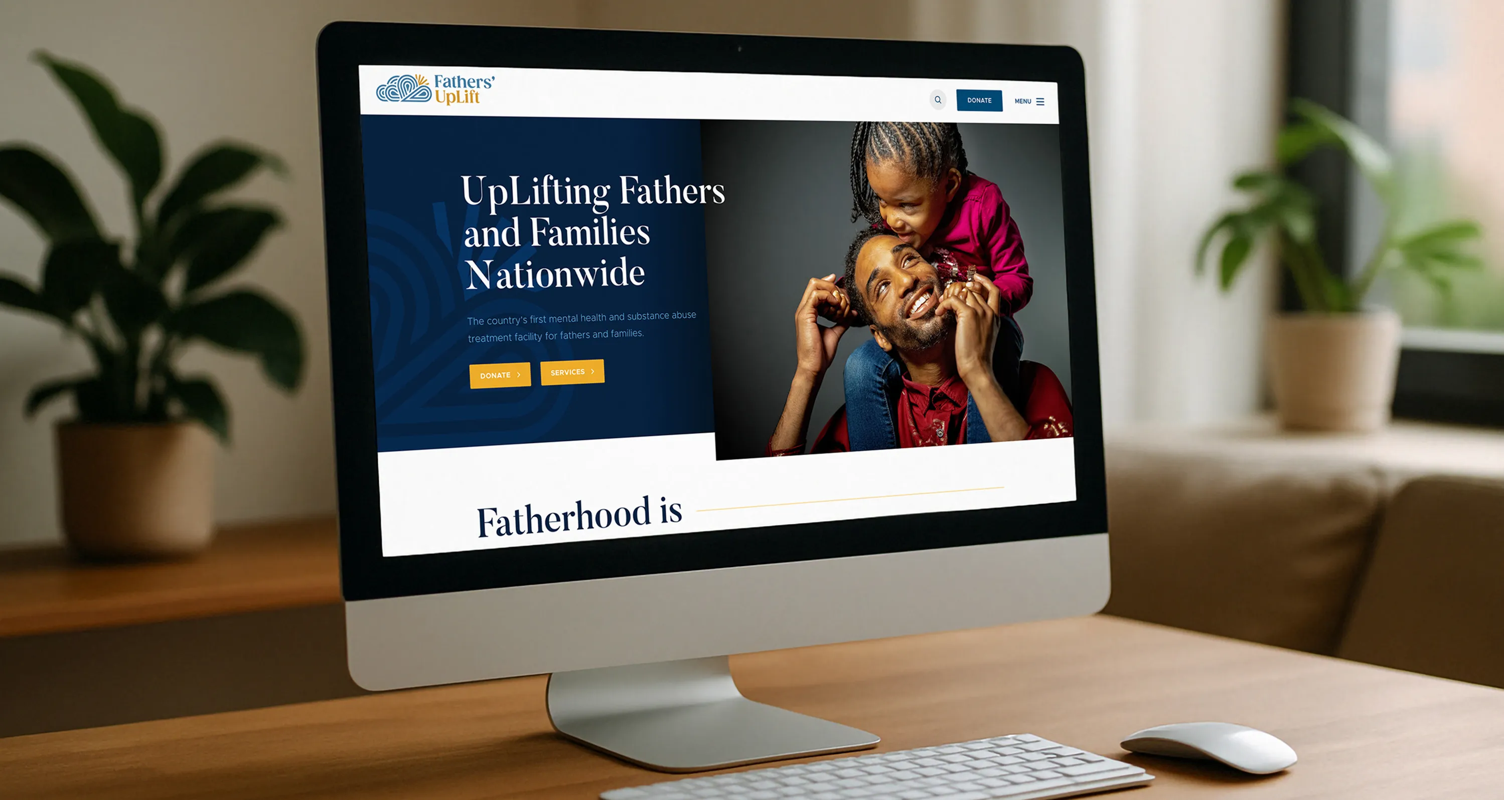
Father’s Uplift needed a strong digital presence to communicate their mission and services clearly. Their old visual identity didn’t fully capture their impact, and the website lacked engaging design elements.
Working with the Jackrabbit Design team, I led the art direction and developed a modern, approachable look and feel. I designed custom iconography to support the brand story and created a website layout that balanced professionalism with warmth. The goal was to make the site visually engaging while keeping usability front and center.
The final design gave Father’s Uplift a bold, recognizable presence. The new iconography and web design improved clarity, consistency, and user engagement—helping the organization better connect with its community.

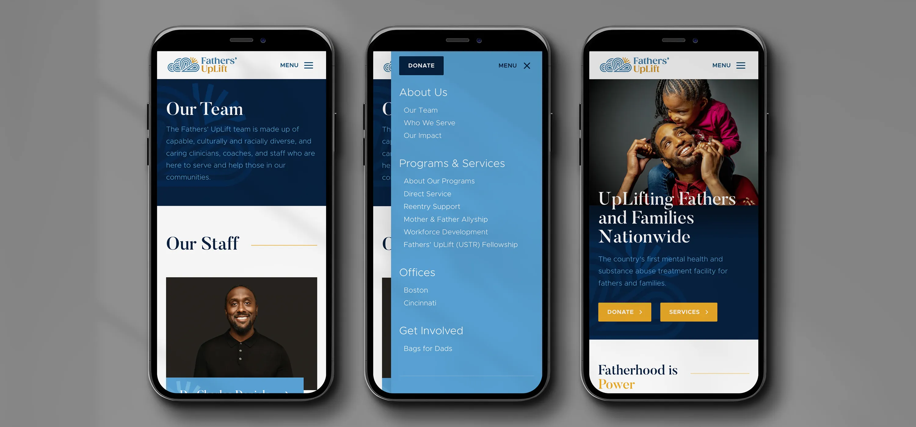
I redesigned the structure and visual language of the site to help Father’s Uplift communicate its mission more clearly and connect better with the families they support. I organized programs into a simple, easy-to-scan layout, refreshed the visual hierarchy, and built modular components that work across pages without feeling repetitive. I tightened the mobile experience, improved the legibility of program details, and used modern photography, typography, and color to give the nonprofit a warmer, more welcoming presence. The design system was built to feel flexible, accessible, and aligned with the organization’s community-focused message.
Since this is a mission-driven nonprofit, clarity and empathy were the priorities. The old structure buried key services and missions, so I focused on making the “what they do” and “who they help” instantly visible. Program cards, testimonials, and impact numbers were intentionally highlighted to build trust and show outcomes. The color palette and imagery were chosen to feel supportive and human, while the layout stays straightforward so parents and families can get to the help they need without friction.

