Creative
- Art Direction
- Design for Jackrabbit Design
- Iconography
- Website Design
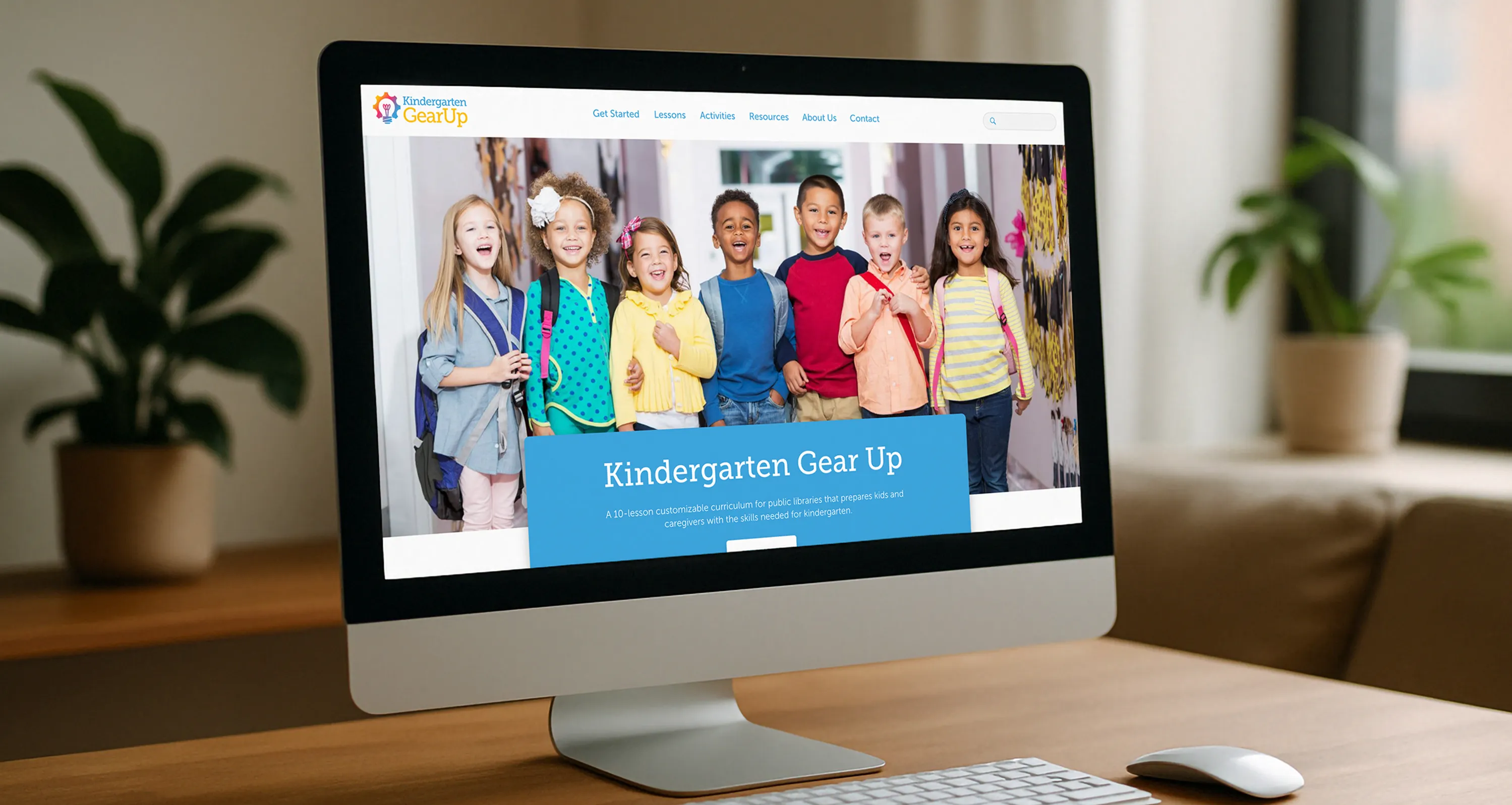
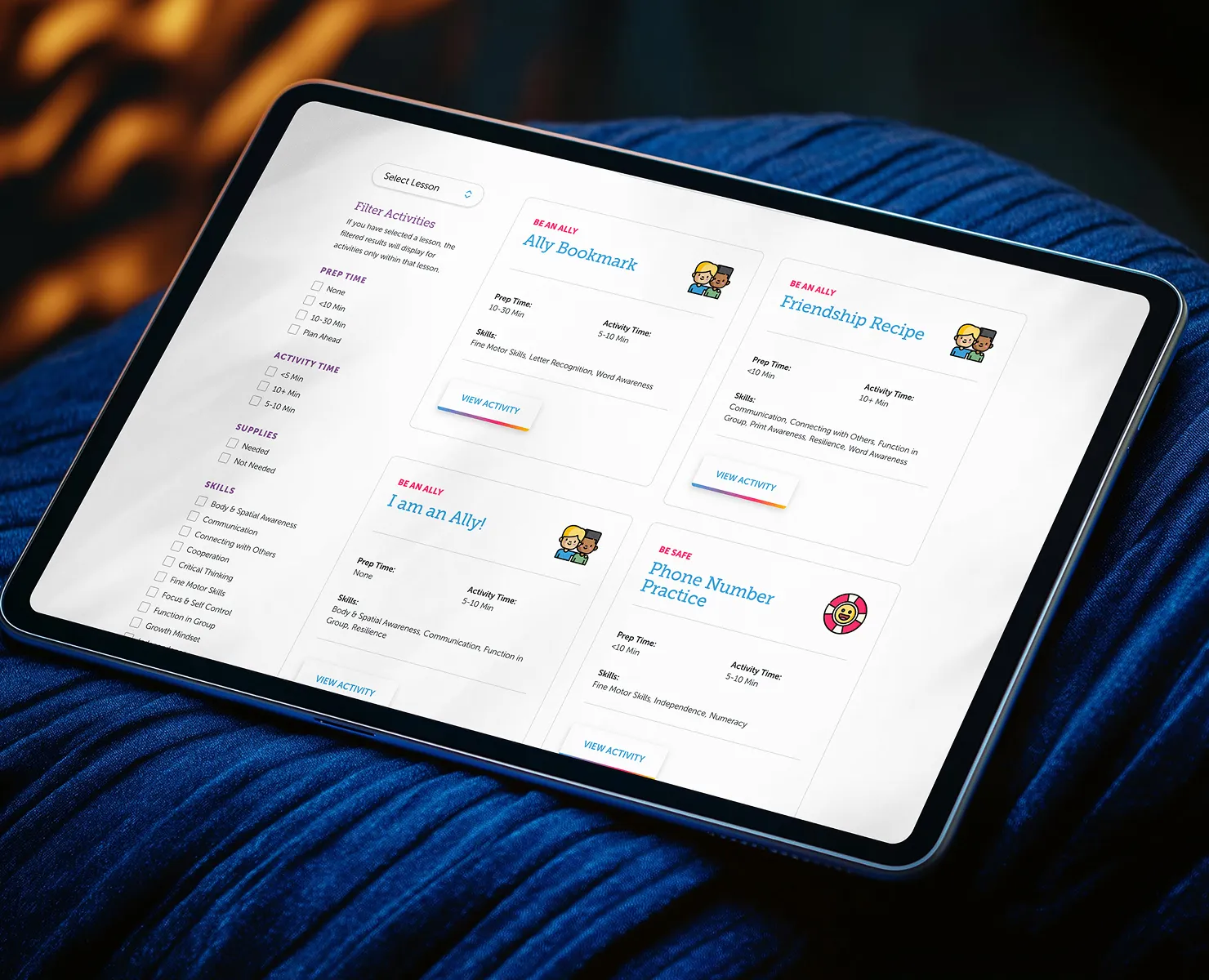
The San Diego County Library needed a full site to host its 10‑lesson customizable curriculum, complete with activities, book lists, and resources for libraries and caregivers. There was no prior website existing for Kindergarten Gear Up. This was a brand new digital presence.
Since there was no prior site, I had a clean slate. I led the creative direction—developing a distinctive visual style and designing custom iconography to synchronize with the curriculum’s friendly, educational tone. I designed the site architecture to make it easy to access lessons, activities, and resource materials. The project embraced clarity, flexibility, and accessibility from the ground up.
The new website launched from scratch, offering a complete, organized digital toolkit that supports public libraries rolling out the curriculum. It presents a cohesive online experience with strong visuals, intuitive navigation, and consistent branding—making Kindergarten Gear Up feel both informative and welcoming.
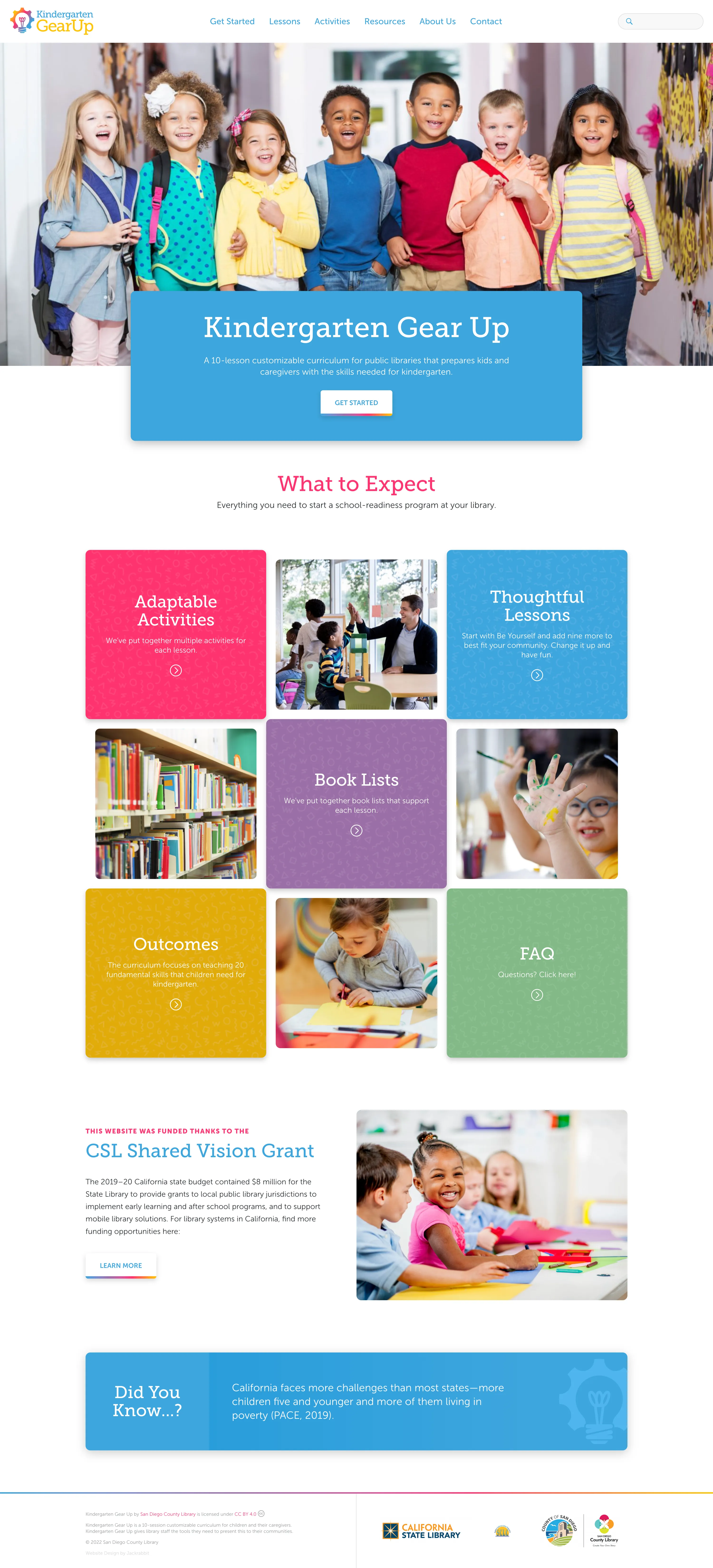
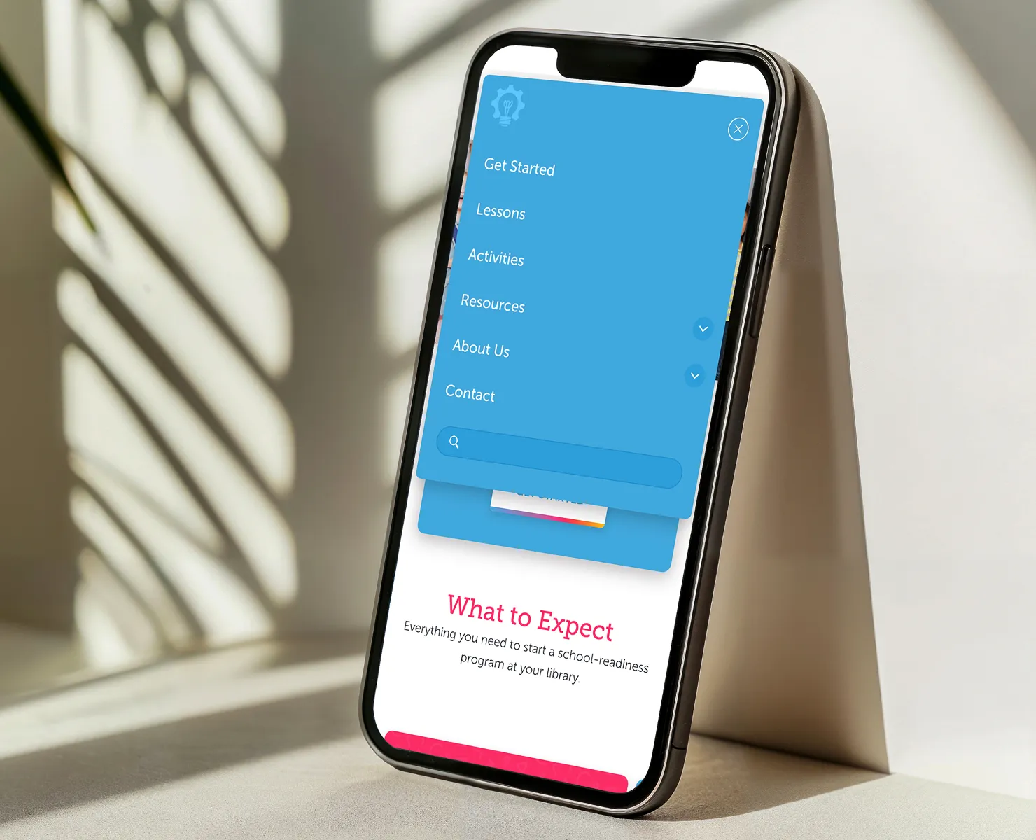
I redesigned the full site layout to make it easier for parents and educators to understand what the program offers, and I built a bright, friendly visual system that feels welcoming and age-appropriate. I organized the content into simple blocks consisting of activities, lessons, book lists, outcomes, and FAQs so visitors can quickly scan. I handled the UI design for desktop and mobile, refreshed the color palette and hierarchy, and built modular components that keep the entire site feeling consistent and easy to browse.
Since this project is aimed at families with young children, the design needed to feel fun, energetic, and easy to understand at a glance. I leaned into bold color blocks, rounded shapes, and warm photography to create a sense of excitement without overwhelming users. The layout is intentionally simple, with clear CTAs and predictable patterns, because parents should never struggle to find details about lessons, expectations, or outcomes. Every design choice was made to balance playfulness with clarity.
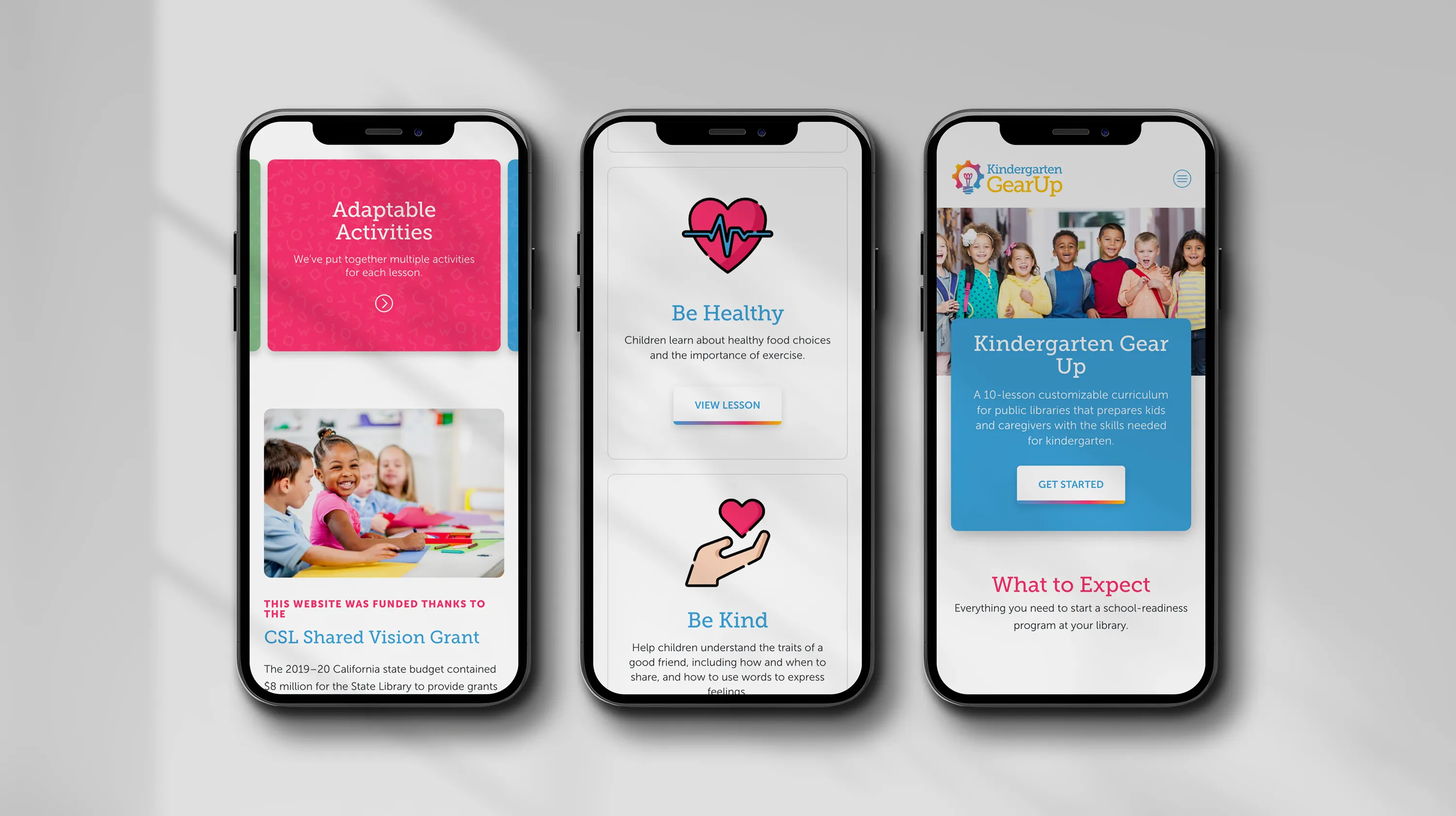
To make the experience feel a bit more playful and memorable, I designed a set of custom icons and added subtle animations that bring extra personality to the page, capturing the fun and inviting atmosphere parents would expect for their children. These animations were kept lightweight so the site stays fast, but they add just enough delight to make the brand feel more engaging for both kids and adults.