Skip to Main Content

Kindergarten Gear Up

Kindergarten Gear Up is a 10-lesson kindergarten readiness curriculum developed for the San Diego County Library system, designed to help families prepare young children for the transition to school. The program provides libraries with a complete toolkit including adaptable activities, book lists, lesson plans, and outcome tracking that they can roll out to the communities they serve. There was no existing website, brand system or digital presence of any kind. This was built from zero.


The Problem

A curriculum is only useful if people can find it, understand it, and use it. Kindergarten Gear Up had strong educational content but no digital infrastructure to support it. Libraries wanting to implement the program had no central resource. Parents trying to understand what the program offered had nowhere to go. The challenge was creating a complete brand experience from scratch that could serve two different audiences simultaneously, while making a 10-lesson curriculum feel approachable rather than overwhelming.

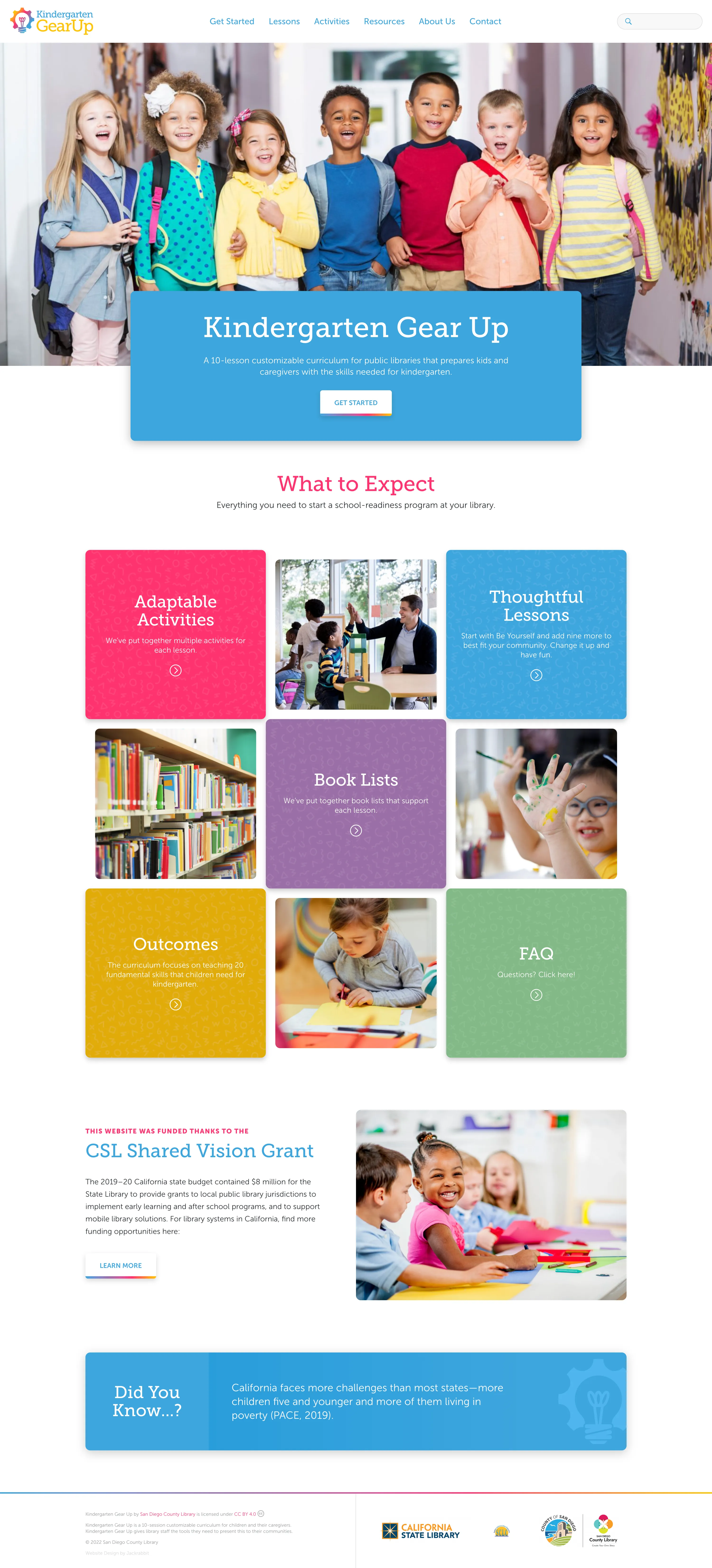
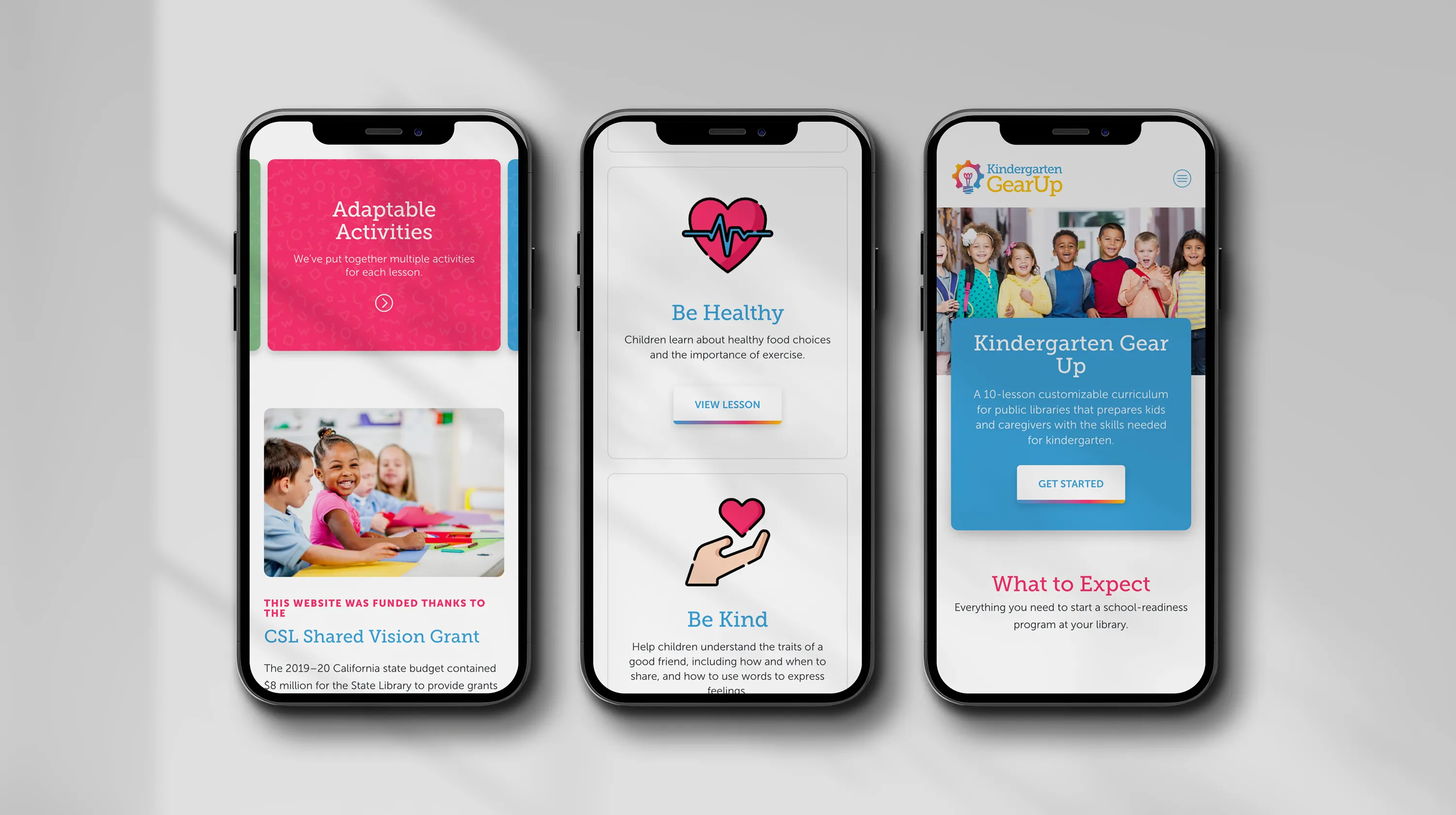
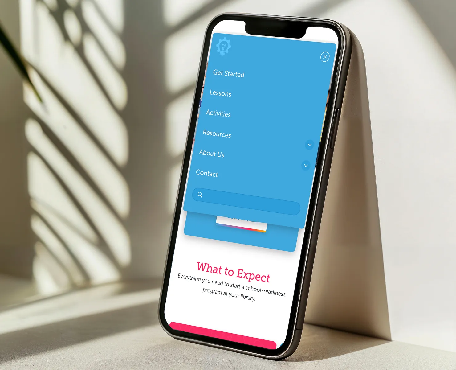
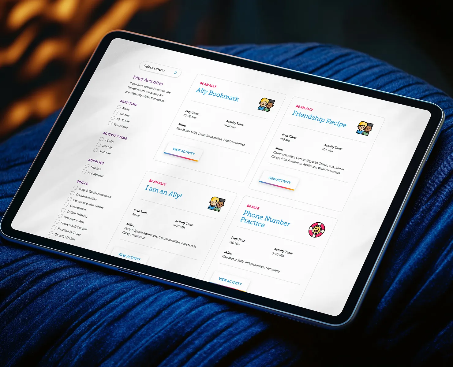
Discovery & Approach

Before any design work began, the most important question was: who is actually using this site, and what do they need from it? Two distinct primary audiences emerged with meaningfully different needs:

  • Kindergarten teachers and librarians implementing the curriculum. They need to quickly assess whether the program fits their context, understand how the lessons are structured, access materials efficiently, and feel confident that the curriculum is credible and well-organized. For this audience, usability and professionalism matter.
  • Parents and caregivers exploring the program for their children. They need to understand what their child will experience, feel reassured that the program is warm and age-appropriate, and find next steps without friction. For this audience, warmth and simplicity matter.

These two audiences have different tolerances for density, different definitions of "easy to navigate," and different emotional contexts when they arrive on the site.

A second key challenge was the content model itself. Ten lessons, each with activities, book lists, outcomes, and resources could easily become an overwhelming wall of information. The site architecture needed to make the curriculum feel manageable and inviting, not exhaustive.

Key Design Decisions

  • Building a visual identity that works for adults and signals safety to parents of young children. The color palette features bold blues, pinks, purples, and greens and is energetic and age-appropriate without being juvenile. It communicates "this is for kids" to parents while remaining organized and credible enough for educators evaluating it professionally. This balance was deliberate; a design that leaned too far into playfulness would undermine trust with librarians, and a design that leaned too far into professionalism would feel cold to families.
  • Using color-blocked content cards to make a complex curriculum scannable. The "What to Expect" grid organizes the curriculum's core components—Adaptable Activities, Thoughtful Lessons, Book Lists, Outcomes, FAQ—into distinct visual blocks with photography. This structure lets both audiences orient themselves immediately without reading a word of body copy. A teacher can see the curriculum scope at a glance. A parent can find what their child will experience without navigating multiple pages.
  • Designing custom iconography to carry the brand across contexts. Rather than relying on generic icons, I created an icon set that reflects the specific content and tone of the program. These icons appear throughout the site and give the brand consistency and personality.
  • Adding lightweight animation to create delight without sacrificing performance. The custom icons include subtle animations that add personality and playfulness to the experience. These were kept intentionally lightweight so the site remains fast across the range of devices families use, including older phones and tablets.
  • Keeping navigation predictable for a non-technical audience. Parents and caregivers shouldn't have to think about where things are. The site uses consistent layout patterns, clear CTAs, and a simple top-level navigation so that someone arriving for the first time can orient themselves immediately regardless of their comfort level with technology.

The Outcome

Kindergarten Gear Up launched with a complete digital presence, brand identity, custom iconography, responsive website, and a content architecture that supports the full curriculum. Libraries implementing the program have a credible, organized resource to point families toward. Parents exploring the program find a site that feels welcoming and gives them exactly what they need to decide whether it's right for their child. The visual system is flexible enough to grow with the program as new lessons, resources, or locations are added.

Note: Post-launch performance metrics were not tracked as part of this engagement.

What I'd Do Differently

With more time, I'd want to test the content grid with actual parents, particularly those with lower digital literacy or whose primary language isn't English. The color-blocked card layout works well visually, but self-selection assumes users can quickly parse what each section means to them. A short onboarding path ("Are you a parent or an educator?") could route each audience more directly to what they need and reduce cognitive load for users who arrive uncertain about where to start.